


Color is much more than a decorative choice in commercial spaces. It functions as a strategic tool that can influence the atmosphere, guide customer behavior, and even elevate how a brand is perceived. Whether in retail, hospitality, or office environments, the right palette can promote engagement and performance while differentiating a business from its competitors. Companies in the Carolinas seeking to enhance their spaces often turn to commercial painting services to execute thoughtful color plans suited to their goals.
From establishing a welcoming first impression to reinforcing company values, color selection plays a pivotal role in the commercial design process. What’s more, new research on color psychology and evolving trends are driving professionals to rethink one-size-fits-all approaches in favor of personalized, experience-driven palettes.
It’s not just public-facing businesses that benefit. The psychological impact of color is also a consideration for property owners seeking residential painting services, underscoring its importance in homes and workplaces.
Leaders in commercial interiors recognize the need to tie visual elements to business objectives. They also stay informed about design advances by consulting trustworthy sources, such as those found on large platforms like Architectural Digest, which profiles shifts in professional color use.
Understanding Color Psychology in Commercial Design
Colors prompt specific emotions and behaviors, often at a subconscious level. For example, blue is frequently associated with calm and trust, making it a popular choice for corporate offices and health centers. This hue helps clients and visitors feel secure, while also encouraging a serene atmosphere that can diffuse tension during meetings. By contrast, shades of red tend to spark excitement and appetite, making them well-suited for restaurants or retail settings focused on driving quick decision-making and impulse purchases. These choices are grounded in years of research, as highlighted by publications such as Psychology Today, which explore the psychological connections between color and behavior.
Current Trends in Commercial Color Palettes
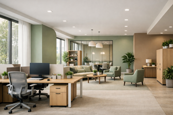
As businesses strive for spaces that feel both modern and inviting, there has been a marked shift toward warmer, more natural hues. According to Behr’s 2026 Commercial Color Forecast, earthy neutrals and immersive greens are setting the tone for offices, lobbies, and retail stores alike. Palettes like EVOLVEDNeutrals and SOULScape are designed around soft, organic tones that provide balance and comfort, meeting the growing demand for environments where people can both relax and engage productively. Many contemporary designers also blend these foundational colors with vibrant accents, adding personality without overwhelming the senses.
Impact of Color on Customer Behavior
Color choices significantly influence how customers feel and act in a commercial setting. Warm colors such as red and orange can create a sense of energy and urgency, nudging visitors toward immediate purchases. These shades can be strategically applied to feature walls and point-of-purchase displays in retail environments. On the other hand, cool colors like blue and green foster relaxation and encourage shoppers to spend more time in a space, increasing the likelihood of repeat business and larger sales. Research consistently finds that lighting and accompanying colors work together to guide shopper experiences and dwell time, both crucial for hospitality and retail operations.
Enhancing Employee Productivity Through Color
In addition to customer-facing benefits, workspace color choices have a measurable effect on employee well-being and output. Blue shades, for instance, enhance focus and efficiency, making them ideal for meeting rooms or areas dedicated to concentrated work. Green, a color associated with nature, is renowned for its calming properties and its ability to reduce eye strain from extended screen time. Higher employee satisfaction and lower stress levels often result from thoughtfully constructed environments that leverage these psychological effects.
Implementing Effective Color Strategies
Businesses aiming to improve their spaces through strategic color use should start by aligning selections with their unique identity and core values. It is important to take into account not only the psychological impact colors may have on clients and staff but also the industry standards and expectations within a given field. Staying informed about color trends and forecasts ensures that spaces feel fresh and contemporary, while testing color schemes in smaller areas can prevent costly mistakes during broader implementation. These practical measures help create environments that function as both beautiful and high-performing assets.
Case Studies: Successful Color Applications
Organizations that invest in strategic color planning often see tangible results. One example is a technology start-up that opted for a mix of blue and green tones throughout its conference rooms and common areas. The aim was to cultivate a calming, focused environment to bolster innovation and teamwork. Post-renovation, the company experienced both a noticeable improvement in employee productivity and positive feedback about the enhanced ambiance.
Conclusion
Choosing the right color scheme is a fundamental, yet often underestimated, aspect of successful commercial design. Businesses that ground their decisions in the latest research and trends are better positioned to engage customers, strengthen their brands, and foster supportive environments for their teams. As the influence of color on behavior and satisfaction becomes more widely understood, its strategic application in business interiors will only continue to grow in importance.